Liquid Energizer is an energy drink brand built to compete in a crowded market of global heavyweights and private labels. The rebrand established a bold, electric identity that cut through at retail, clarified flavor navigation, and scaled seamlessly across multiple SKUs and markets.
From Static to Electric. Watch the brand come to life.
The Brief
Strategic Approach
The Brief
Compete with big beverage brands, on independent budgets. Make Liquid Energizer jump off crowded cooler shelves. Build a brand scalable across borders and formats.
Role
Strategic Approach
The Brief
As Creative Director, I led the full brand overhaul. From strategy and visual identity to packaging, in-store marketing, and rollout. I collaborated with production vendors, marketers, and flavor teams to build a cohesive, high-impact system.
Challenge
Strategic Approach
Strategic Approach
Liquid Energizer was drowning in generic visuals and flavor confusion. Overwhelmed by brands like Red Bull and store knockoffs, it lacked both shelf presence and recognition.
Strategic Approach
Strategic Approach
Strategic Approach
Liquid Energizer needed more than new packaging. It needed a positioning strategy to stand out in one of the most saturated categories in retail. My approach was to:
- Audit the shelf: Red Bull, Monster, and store brands all leaned heavily on red/black metallic palettes. I chose to break that pattern with high-contrast black and electric acc
Liquid Energizer needed more than new packaging. It needed a positioning strategy to stand out in one of the most saturated categories in retail. My approach was to:
- Audit the shelf: Red Bull, Monster, and store brands all leaned heavily on red/black metallic palettes. I chose to break that pattern with high-contrast black and electric accents.
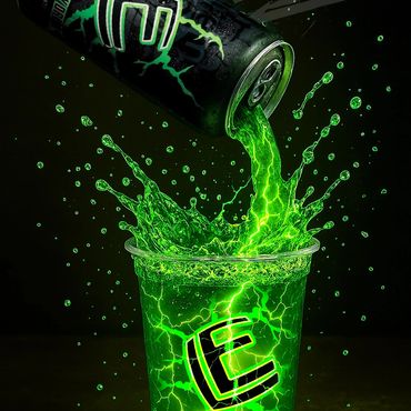
- Build intrigue: Instead of naming the new green flavor, I left it as “Green.” Curiosity drove trial, and it quickly became the #2 best seller.
- Design for scale: Every element: color blocks, lightning motif, typography, was created to flex across new SKUs, retail displays, and even international markets.
This gave the brand a strategy-first foundation, ensuring that design wasn’t just cosmetic, it was built to win at retail and grow globally.

Measured growth in multiple retail channels within months of launch.
Rapid adoption at retail, strong reorder rates, and international expansion.
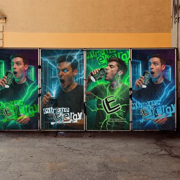
Campaign visuals extended across print, retail, and street-level ads
Creative Strategy
The strategy was built around making Liquid Energizer impossible to miss:
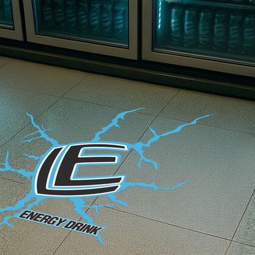
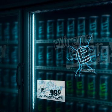
- Bold Identity: Black base with electric accents, lightning motif, and strong geometry.
- Flavor System: Each SKU assigned a distinct, vibrant palette for instant recognition.
- The “Mystery Green”: Deliberately unnamed flavor to spark curiosity and trial.
- Scalable Design: System built to expand easily across future flavors, multipacks, and retail campaigns.
Design Execution
I created a modular system that unified every SKU visually while making each flavor distinct. Typography, color, and layout rules ensured consistency across cans, cartons, and advertising. The result was a clean, premium design that projected power from a distance.
Production & Launch Assets
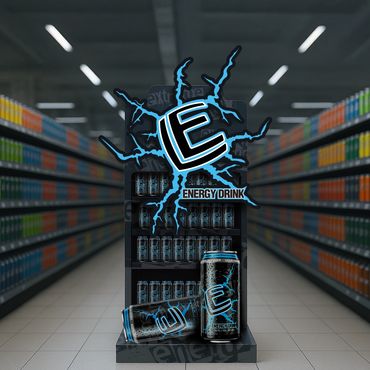
• POP & Merch: End-cap displays, cooler wraps, die-cut floor stickers
• Print: Shelf-talkers, counter displays, promo flyers
• Ad Collateral: Window clings, teaser posters, street-level materials
• Production Oversight: Print file prep, dielines, color matching, vendor liaison
Reflection
This project demonstrates how full-spectrum creative direction. Panning digital, print, product, and retail, transform a struggling brand into a shelf-dominating contender. The redesign increased retail velocity, improved reorder rates, and elevated perceived value with both customers and distributors.
Have a brand that needs to stand out in crowded markets?
Branded Commercial Concept + Packaging in Action
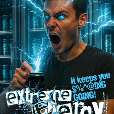
I conceptualized and designed this campaign video for Liquid Energizer to blend humor with high-energy storytelling. It follows a teen bursting with energy after drinking Liquid Energizer, only to be caught in a hilarious twist while polishing a mountain of shoes. The spot highlights the brand’s bold, youthful tone and unexpected punch.
The redesign changed everything. It gave our brand a future.
— Owner, Edward P.
Copyright © 2026 Saad Chammas. All rights reserved.