
Krisp is a natural food and beverage brand expanding from a local favorite into a scalable grocery line. The redesign modernized the identity, unified the packaging system, and created a platform for flavor expansion and national retail distribution.
The Brief
Strategic Approach
The Brief
Krisp, a natural-foods market concept based in San Diego, approached me to create a full-scale brand identity and retail experience that could compete in an established and competitive market. The scope included naming support, brand identity, environmental design, packaging, sub-brand development, and marketing assets. The brand needed t
Krisp, a natural-foods market concept based in San Diego, approached me to create a full-scale brand identity and retail experience that could compete in an established and competitive market. The scope included naming support, brand identity, environmental design, packaging, sub-brand development, and marketing assets. The brand needed to feel fresh, approachable, and modern while standing apart from typical organic grocery aesthetics.
Role
Strategic Approach
The Brief
Lead Designer and Creative Director for the full scope of Krisp’s brand development. Oversaw every stage from brand strategy, identity design, and environmental concepting to packaging systems, sub-brand creation, and production coordination.
Challenge
Strategic Approach
Strategic Approach
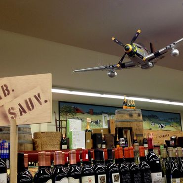
Natural grocery retail in Southern California is saturated with brands that lean on generic “farm-fresh” cues; earth tones, scripted typography, and predictable produce imagery. Krisp needed a point of difference that could translate across physical space, packaging, and sub-brands, while feeling authentic and premium. The brand also requ
Natural grocery retail in Southern California is saturated with brands that lean on generic “farm-fresh” cues; earth tones, scripted typography, and predictable produce imagery. Krisp needed a point of difference that could translate across physical space, packaging, and sub-brands, while feeling authentic and premium. The brand also required a scalable system that could house multiple in-store sub-brands under one visual architecture without diluting the master identity.
Strategic Approach
Strategic Approach
Strategic Approach
Position Krisp as a design-forward farmers market, elevating freshness through bold, clean identity work paired with an immersive store environment. Every touchpoint, from packaging to tile color, would reinforce the brand’s modern agricultural ethos. Sub-brands would borrow core elements from the Krisp identity to maintain cohesion while expressing their own personality.

Design Execution
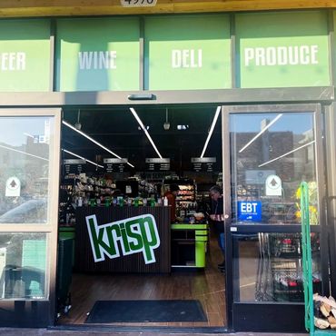
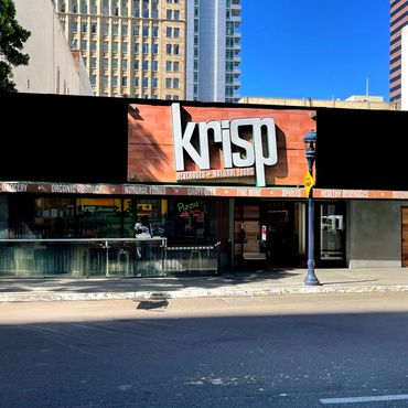
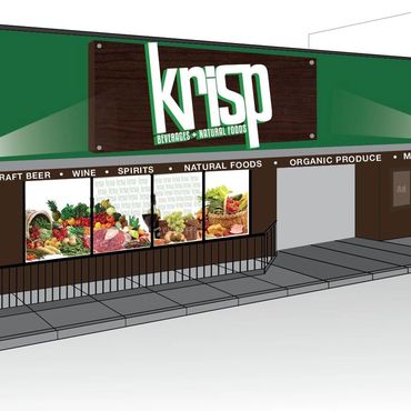
• Identity: Developed a custom logomark balancing strong geometric forms with organic curves to convey freshness and modernity. Selected an earth-inspired color palette drawn from produce and natural materials, paired with a typography system that could flex across packaging, signage, and marketing materials.
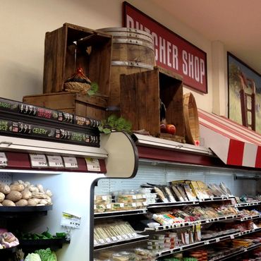
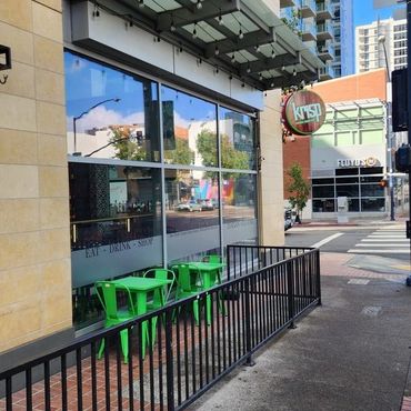
• Environment: Designed the store interiors to evoke an outdoor, market-like feel using raw wood, green ceramic tile, and warm lighting. The spatial plan was intentionally open, guiding customers through fresh produce into specialty areas such as prepared foods, beer, and pizza.
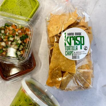
• Packaging and Labeling: Created a packaging system that extended the brand’s interior textures and colors into grocery bags, shelf talkers, and signage. Designed the Krisp Tortilla Chips label to stand out on shelves while maintaining visual harmony with the core identity, using bold typography and clean graphics to emphasize product freshness.
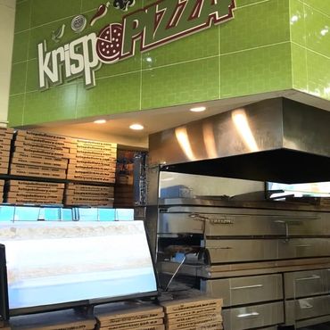
• Sub-Brand Development: Designed identities for Krisp Pizza and Best Damn Beer Shop, ensuring each felt distinct yet aligned to the master brand. Adapted typography, color cues, and graphic styling for seamless integration within the larger Krisp experience.
Production & Collaboration
Worked closely with interior contractors, sign fabricators, and print vendors to ensure brand elements were executed with consistency and quality. Oversaw color matching across packaging and environmental elements to preserve brand integrity. Coordinated with in-house teams to align sub-brand rollouts with store openings.
Results
• Three San Diego locations launched within the first year of brand completion
• Strong community recognition and local press coverage within weeks of opening
• Sub-brands generated notable incremental revenue while reinforcing Krisp’s lifestyle positioning
• Krisp Tortilla Chips packaging drove rapid sell-through and became a customer favorite among in-house products
Reflection
Krisp’s success came from treating the brand as an experience rather than a logo. By linking identity, environment, packaging, and sub-brands through a single design system, we built a foundation that could scale without losing its essence. The project reinforced the importance of brand architecture when creating multi-channel retail environments.
Want to see how a cohesive, scalable brand system can elevate your business?
Working with Saad was truly amazing. He understood our vision and took it to the next level.
— Owner, Omar Mikhail
Copyright © 2026 Saad Chammas. All rights reserved.