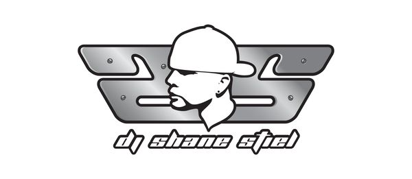
DJ Shane Stiel is more than a DJ. He is a performer, producer, fitness model, and brand in motion. His career spans high-energy club nights, international events, and a public presence that demands consistency across music, fashion, and digital platforms. The challenge was to create a visual identity that could live in all those spaces, adapt to varied contexts, and remain instantly recognizable — from a festival main stage to a gym photoshoot to a piece of merchandise in a fan’s hands.
The Brief
Strategic Approach
The Brief
Shane needed a personal brand identity that could unify his work as a DJ, model, and fitness figure, while standing out in the saturated EDM and lifestyle markets. The design had to be bold yet versatile, instantly legible in print, digital, and physical merchandise. Above all, it had to reflect his personality — clean, confident, and hig
Shane needed a personal brand identity that could unify his work as a DJ, model, and fitness figure, while standing out in the saturated EDM and lifestyle markets. The design had to be bold yet versatile, instantly legible in print, digital, and physical merchandise. Above all, it had to reflect his personality — clean, confident, and high-impact — without leaning on the visual clichés common in DJ branding.
Role
Strategic Approach
The Brief
Lead Designer & Creative Director — responsible for brand strategy, visual identity, typography and color systems, logo design, merchandise applications, social media design kits, and creative direction for photography and promotional materials.
Challenge
Strategic Approach
Strategic Approach
The DJ and nightlife space is filled with aggressive logos, neon overload, and trend-chasing visuals that burn out quickly. Shane’s brand had to strike the right balance between edge and longevity. It also needed to bridge the gap between his on-stage persona and his off-stage lifestyle brand — two worlds that attract overlapping but distinct audiences.
Strategic Approach
Strategic Approach
Strategic Approach
Logo & Icon
A face-inspired mirrored SS monogram, designed to work in both flat and polished metal executions.
Typography
A bold, modern sans serif family that balances presence with clarity, maintaining readability at small sizes.
Color Palette
A core black-and-white foundation for versatility, with silver metallic accents for stage and m
Logo & Icon
A face-inspired mirrored SS monogram, designed to work in both flat and polished metal executions.
Typography
A bold, modern sans serif family that balances presence with clarity, maintaining readability at small sizes.
Color Palette
A core black-and-white foundation for versatility, with silver metallic accents for stage and merchandise applications.
Merchandise Applications
Hoodies, tees, and caps produced with high-contrast print and embroidered finishes, ensuring visibility under club lighting.
Digital & Social
Custom templates for event flyers, motion graphics for social platforms, and DJ set visuals incorporating the metallic mark.
Production & Collaboration
Partnered with merchandise producers for embroidery and foil print testing to achieve a premium finish. Collaborated with event photographers to integrate the logo seamlessly into stage visuals and promotional content. Worked closely with Shane to ensure the brand felt authentic and aligned with his personal style in both fitness and music contexts.
Results
The rebrand sharpened Shane’s market presence, creating a consistent visual language across all touchpoints. Merchandise sold out at multiple events within weeks of launch. His social engagement increased significantly, with fans adopting the logo as a badge of identity. Bookings expanded to new cities and venues. His visual presence matched the energy and professionalism of his live performances.
Reflection
A personal brand is only as strong as its ability to remain authentic while scaling across platforms. For Shane, building a brand anchored in his identity allowed us to create a flexible system that works as well on a festival poster as it does on a fitness campaign. The mark is a visual shorthand for his style, his presence, and his energy — without relying on short-lived trends.
Want to see how a bold, adaptable identity can elevate your personal brand and connect across multiple industries?
My logo is me. It stands out, it connects, and it works everywhere — from my merch to my socials to the stage lights. The feedback has been unreal.
— Shane Stiel
Copyright © 2026 Saad Chammas. All rights reserved.